
Longevity Lab Website
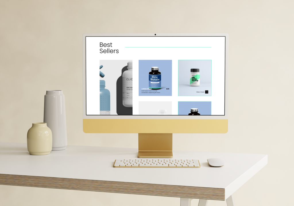
When designing the Longevity Lab website, I set out to craft a digital experience that reflected the brand’s commitment to clarity, vitality and forward-thinking health. Drawing on their ethos that longevity isn’t just adding years—but enhancing quality and purpose—I approached the site as a canvas to reflect well-being through design.
The layout embraces a clean visual architecture, featuring spacious sections, modern typography and subtle transitions — all designed to guide the user smoothly through the story, service offers and scientific grounding. At the heart of the site are strategic visuals and a restrained palette, letting the brand’s content shine without distraction. The geometric elements and minimal lines echo the idea of precision and care inherent in the Longevity Lab philosophy.
In addition to the static pages, I developed a scalable component system for recurring modules—service blocks, expert bios, blog-style content—ensuring that future updates and growth remain seamless. I also provided a responsive design strategy to guarantee optimal performance across devices—from desktop through to mobile—ensuring that the experience of exploration remains effortless no matter how the site is viewed.
Beyond aesthetics, the website is designed to reflect trust and authority. Each section of copy, visual asset and layout decision was aligned with the brand promise: actionable insights into health, built on an accessible yet scientifically-grounded foundation. The result is a website that not only presents Longevity Lab’s services with clarity, but invites users to engage, understand and take meaningful action toward longer, more fulfilled lives.
Marketing Agency Website
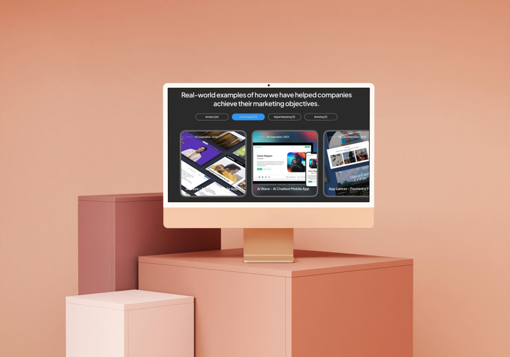
This web design concept for a marketing agency combines elegance with a modern tech feel. Rounded edges and clean layouts give it a polished, approachable look, while subtle details and a sleek structure emphasize innovation and professionalism. The result is a design that feels both stylish and forward-thinking.
Brand Design – Code
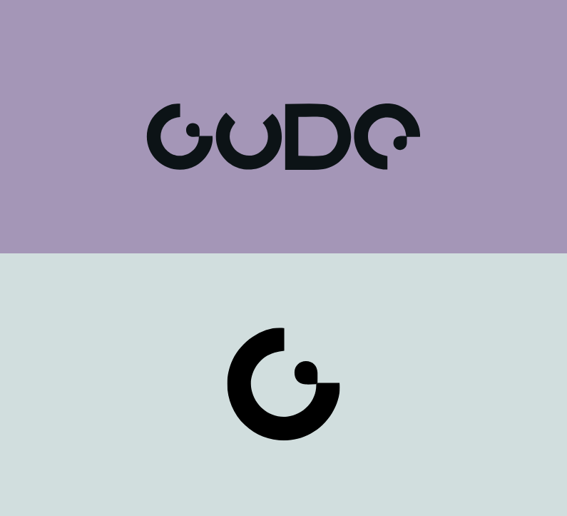
When designing the brand identity for Code, I sought to capture the essence of a forward-looking tech brand—one that is precise, dynamic and visually refined. The visual system begins with a bold word‐mark crafted in a clean, geometric sans-serif typeface, which establishes a sense of technical clarity and discipline. The accompanying mark draws inspiration from binary logic and modular systems—subtle cues that hint at code, algorithmic structure and digital architecture.
Colour and layout are treated with intentional restraint: a limited palette and ample negative space allow the core symbol to command attention while the identity remains flexible and adaptable across platforms. Modular grid constructions and subtle line‐work create a framework where each touchpoint—be it stationery, digital interface or environmental application—feels part of a unified system.
Beyond the visuals, I developed an identity toolkit including typography rules, iconography derived from structural elements, and mock-ups that show how the brand scales from business cards to web banners and signage. The resulting solution isn’t just visually consistent—it reflects Code’s ambition: to articulate complexity through clarity, to embody innovation without extravagance, and to anchor technical sophistication in a design language that feels approachable.