Pioner – Trading Company Branding
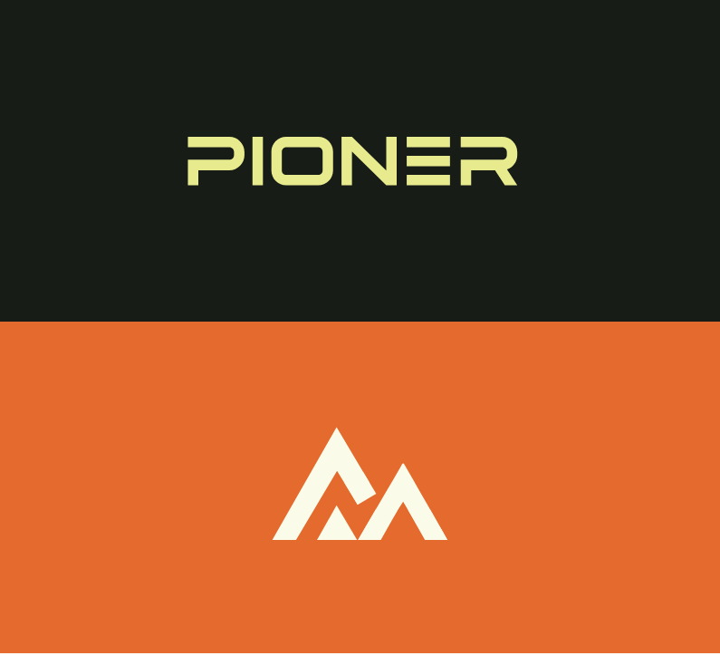
When building the brand for Pioner, I aimed to capture the energy of a trail-blazing company — fresh, decisive, and modern in its approach. The foundation of the identity lies in a geometric sans-serif logotype, designed to communicate precision and progress. The arrow-inspired mark symbolizes forward motion, ambition, and the brand’s continuous drive toward innovation and leadership in its field.
The color palette was intentionally kept restrained yet distinctive, allowing the logo to stand out while maintaining a clean, professional presence across various mediums. This minimalist approach ensures clarity, recognition, and adaptability, whether applied to digital interfaces, printed materials, or environmental signage.
Alongside the visual identity, I developed supporting brand elements that reinforce consistency — from typography guidelines and layout principles to mockups showcasing real-world applications. The end result is a cohesive and scalable brand system that reflects Pioner’s pioneering mindset and builds an immediate sense of trust and momentum.
Brand Design – Code
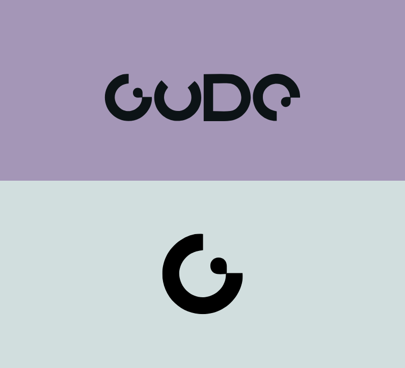
When designing the brand identity for Code, I sought to capture the essence of a forward-looking tech brand—one that is precise, dynamic and visually refined. The visual system begins with a bold word‐mark crafted in a clean, geometric sans-serif typeface, which establishes a sense of technical clarity and discipline. The accompanying mark draws inspiration from binary logic and modular systems—subtle cues that hint at code, algorithmic structure and digital architecture.
Colour and layout are treated with intentional restraint: a limited palette and ample negative space allow the core symbol to command attention while the identity remains flexible and adaptable across platforms. Modular grid constructions and subtle line‐work create a framework where each touchpoint—be it stationery, digital interface or environmental application—feels part of a unified system.
Beyond the visuals, I developed an identity toolkit including typography rules, iconography derived from structural elements, and mock-ups that show how the brand scales from business cards to web banners and signage. The resulting solution isn’t just visually consistent—it reflects Code’s ambition: to articulate complexity through clarity, to embody innovation without extravagance, and to anchor technical sophistication in a design language that feels approachable.