
Pioner – Trading Company Branding
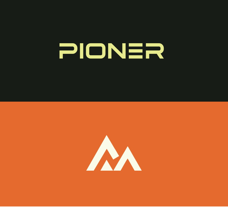
When building the brand for Pioner, I aimed to capture the energy of a trail-blazing company — fresh, decisive, and modern in its approach. The foundation of the identity lies in a geometric sans-serif logotype, designed to communicate precision and progress. The arrow-inspired mark symbolizes forward motion, ambition, and the brand’s continuous drive toward innovation and leadership in its field.
The color palette was intentionally kept restrained yet distinctive, allowing the logo to stand out while maintaining a clean, professional presence across various mediums. This minimalist approach ensures clarity, recognition, and adaptability, whether applied to digital interfaces, printed materials, or environmental signage.
Alongside the visual identity, I developed supporting brand elements that reinforce consistency — from typography guidelines and layout principles to mockups showcasing real-world applications. The end result is a cohesive and scalable brand system that reflects Pioner’s pioneering mindset and builds an immediate sense of trust and momentum.