
Amazon A+ Product Design Layout
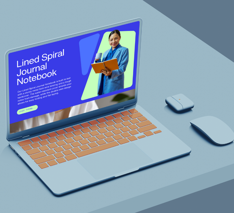
The goal of this project was to create a clean, elegant, and conversion-focused A+ content layout for a premium notebook brand on Amazon. The design highlights the notebook’s quality, functionality, and craftsmanship while maintaining a calm, sophisticated visual tone.
Each section of the layout was carefully structured to guide the viewer through the product story — from material details and paper texture to usability and lifestyle appeal. I used soft color accents, modern typography, and minimal iconography to evoke a sense of organization, creativity, and everyday inspiration.
The overall composition balances visual storytelling and product clarity, ensuring shoppers immediately understand what sets this notebook apart. The final result is an A+ layout that elevates brand perception, communicates value, and helps drive engagement and conversions on the Amazon platform.
Bitcoin Website
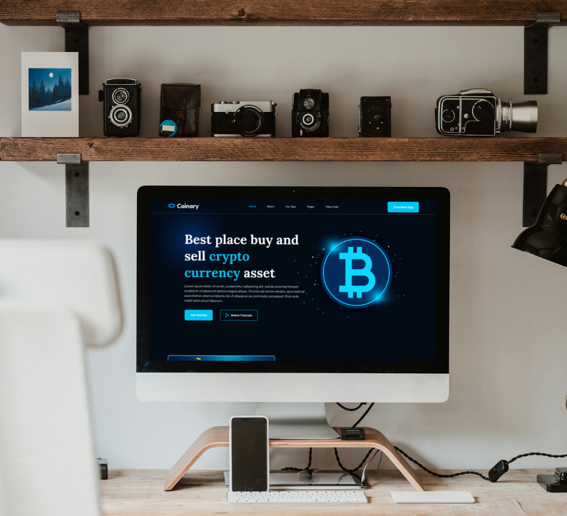
For this project, I approached the website design with the goal of combining elegance and effectiveness—creating a digital presence that not only looks great but guides the visitor intuitively. Using Figma as my primary tool, I constructed a modular design system where layout, colour, typography and imagery all work in harmony.
The homepage features a clean hero section with ample white‑space, refined typography and a clear visual hierarchy that invites users into the brand story. Subsequent sections follow a consistent grid and spacing rhythm, ensuring visual coherence and ease of navigation across the site. Rounded corners and subtle shadows add a modern, friendly touch without distracting from the core content.
Supporting pages (about, services, contact) leverage the same design foundation but introduce slight variations in visual tone to reflect their unique purpose. I built each component to be reusable and adaptive—so whether on desktop, tablet or mobile, the design scales gracefully. The Figma files include reusable UI components, style‑guides and responsive layouts, laying the groundwork for smooth hand‑off to development.
In addition to visual design, I considered user experience flow: each section transitions naturally, CTA placements are thoughtfully chosen, and imagery is curated to enhance trust and professionalism. The result is a website design that encapsulates brand identity, supports strategy and delivers a seamless user experience.
Amazon A+ Product Design
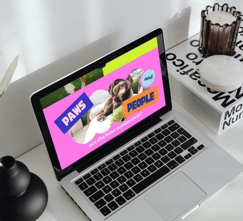
The goal of this project was to create a vibrant, engaging, and conversion-driven A+ content layout for an Amazon dog toy brand. I wanted the design to reflect the brand’s fun personality while ensuring that every section communicates trust, product quality, and value at a glance.
The visual approach is bright, playful, and full of life, using bold color combinations, friendly typography, and cheerful illustrations that instantly appeal to pet owners. Each module is designed to catch attention while maintaining clarity and hierarchy, ensuring that shoppers can easily absorb information about the toys’ materials, safety, and benefits.
The structure follows Amazon’s best UX practices for A+ content — a mix of image-driven storytelling, iconography, and concise text blocks that highlight the brand’s strengths and key differentiators. Whitespace and rhythm between sections keep the content light and readable, while high-resolution product photography emphasizes texture, durability, and joyful expression.
Redesign of Apple landing page
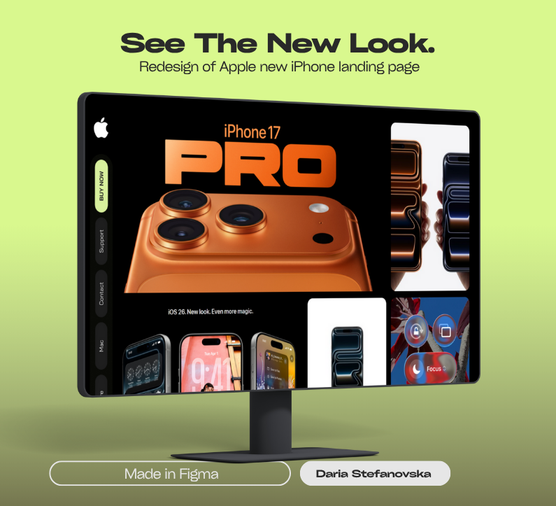
When approaching the redesign of the Apple landing page, I set out to honour the brand’s legacy of clarity, elegance and high performance — while bringing a fresh perspective that emphasises modern interaction and refined visual hierarchy. At the heart of the redesign is a clean, progressive layout that respects Apple’s minimalist aesthetic yet introduces purposeful nuance: spacious sections, bold yet subtle typography, and a visual rhythm that guides the user gently but decisively from hero to call-to-action.
The logotype and imagery take centre-stage; high-impact visuals are used sparingly but strategically, letting each element breathe. I anchored the design with a limited, refined colour palette—primarily monochrome with carefully chosen accent tones—to maintain premium perception and allow product visuals to shine. Rounded edges on containers, consistent spacing and subtle micro-interactions (hover states, reveal animations) bring depth without distraction. The module-based grid ensures consistency and scalability across devices and future launches.
Functionally, I developed a component library including hero blocks, feature galleries, testimonial sections and CTA bars—all built in Figma and refined in Adobe Photoshop for high-fidelity visuals. This system supports swift updates for upcoming campaigns, product launches and global variants. Responsive design was baked in from the start—mobile, tablet and desktop layouts were optimized, and performance-conscious assets were prepared to ensure fluid load and navigation.
The outcome is a landing page experience that feels unmistakably Apple — polished, authoritative and sleek—yet resonates with today’s user expectations for seamless design. It’s a digital invitation to explore, engage and convert, built to reflect Apple’s ethos while aligning with evolving web standards.
Real Estate Company Website Design
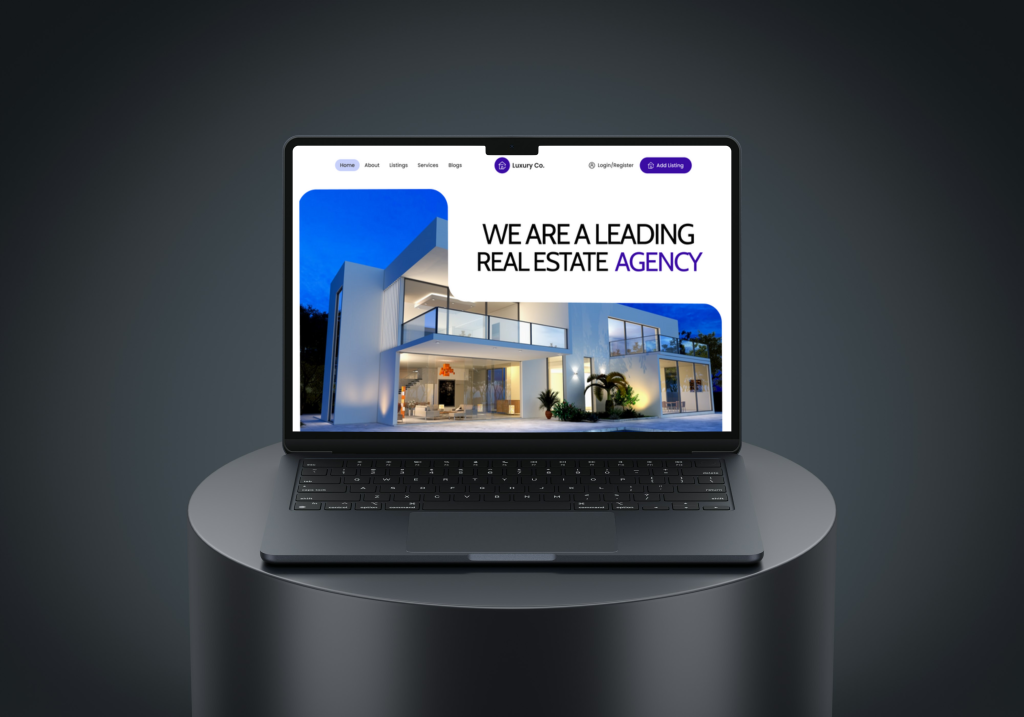
The LuxuryCo website was designed to embody refinement, exclusivity, and contemporary sophistication. Every visual element—from the soft rounded edges to the balanced composition—was carefully crafted to communicate a feeling of luxury and effortless style.
The design language focuses on clean geometry, muted tones, and spacious layouts, allowing the brand’s premium aesthetic to take center stage. Typography plays a key role in establishing hierarchy and tone, combining sleek modern fonts with delicate contrast for a timeless appeal.
Interactive elements are kept minimal yet elegant, enhancing the browsing experience without overwhelming the user. Each page flows seamlessly into the next, mirroring the calm and confidence that define high-end brands.
The result is a visually refined, user-focused website that translates LuxuryCo’s identity into a sophisticated digital experience — merging aesthetics and usability in a way that feels both modern and unmistakably premium.
Longevity Lab Website
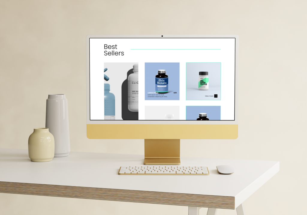
When designing the Longevity Lab website, I set out to craft a digital experience that reflected the brand’s commitment to clarity, vitality and forward-thinking health. Drawing on their ethos that longevity isn’t just adding years—but enhancing quality and purpose—I approached the site as a canvas to reflect well-being through design.
The layout embraces a clean visual architecture, featuring spacious sections, modern typography and subtle transitions — all designed to guide the user smoothly through the story, service offers and scientific grounding. At the heart of the site are strategic visuals and a restrained palette, letting the brand’s content shine without distraction. The geometric elements and minimal lines echo the idea of precision and care inherent in the Longevity Lab philosophy.
In addition to the static pages, I developed a scalable component system for recurring modules—service blocks, expert bios, blog-style content—ensuring that future updates and growth remain seamless. I also provided a responsive design strategy to guarantee optimal performance across devices—from desktop through to mobile—ensuring that the experience of exploration remains effortless no matter how the site is viewed.
Beyond aesthetics, the website is designed to reflect trust and authority. Each section of copy, visual asset and layout decision was aligned with the brand promise: actionable insights into health, built on an accessible yet scientifically-grounded foundation. The result is a website that not only presents Longevity Lab’s services with clarity, but invites users to engage, understand and take meaningful action toward longer, more fulfilled lives.
Marketing Agency Website
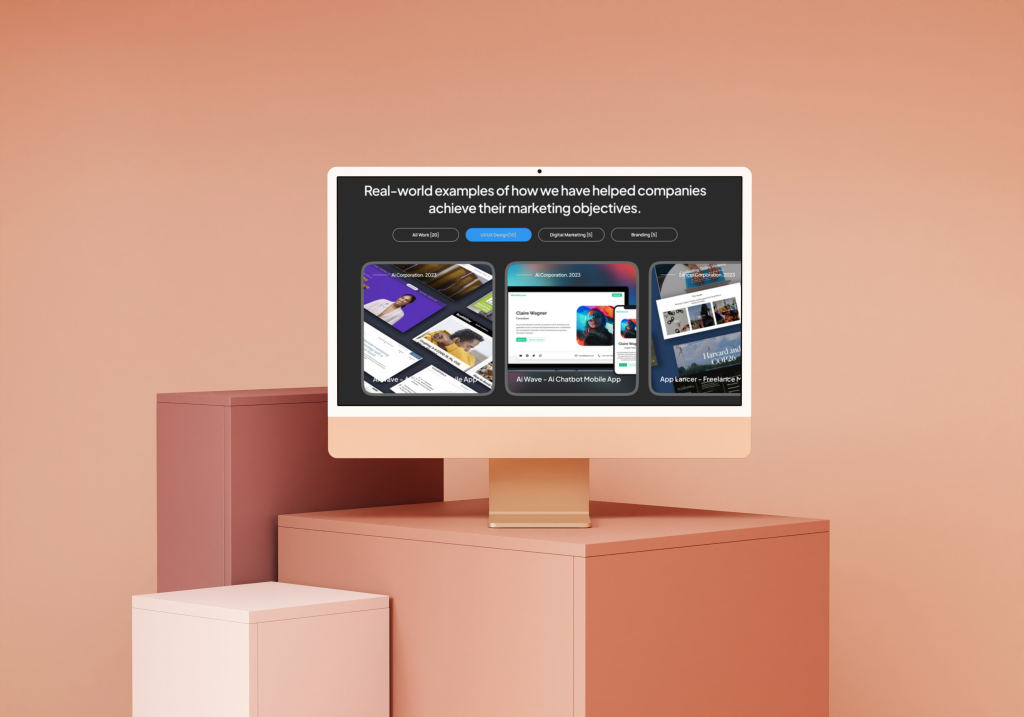
This web design concept for a marketing agency combines elegance with a modern tech feel. Rounded edges and clean layouts give it a polished, approachable look, while subtle details and a sleek structure emphasize innovation and professionalism. The result is a design that feels both stylish and forward-thinking.