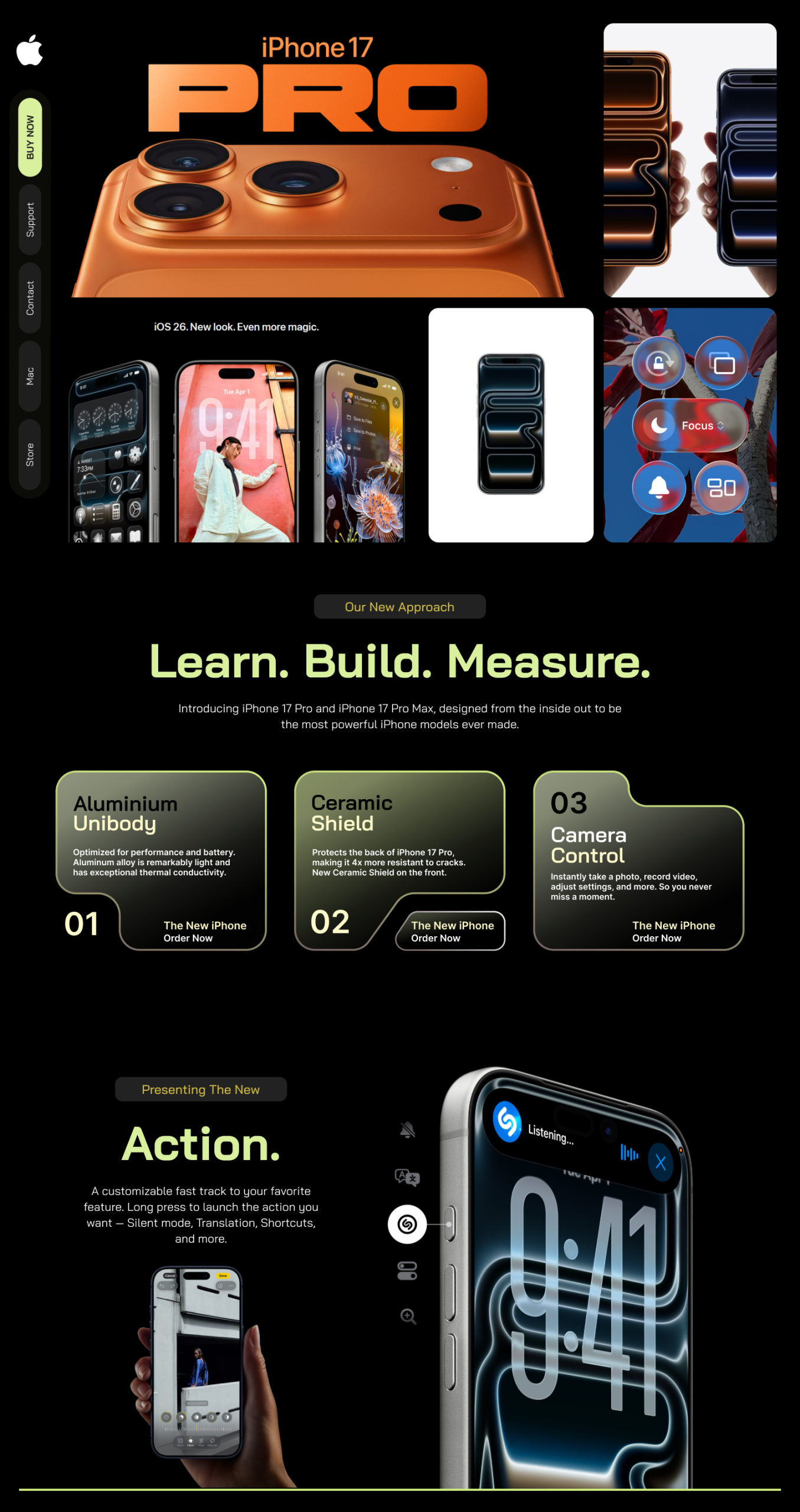
When approaching the redesign of the Apple landing page, I set out to honour the brand’s legacy of clarity, elegance and high performance — while bringing a fresh perspective that emphasises modern interaction and refined visual hierarchy. At the heart of the redesign is a clean, progressive layout that respects Apple’s minimalist aesthetic yet introduces purposeful nuance: spacious sections, bold yet subtle typography, and a visual rhythm that guides the user gently but decisively from hero to call-to-action.
The logotype and imagery take centre-stage; high-impact visuals are used sparingly but strategically, letting each element breathe. I anchored the design with a limited, refined colour palette—primarily monochrome with carefully chosen accent tones—to maintain premium perception and allow product visuals to shine. Rounded edges on containers, consistent spacing and subtle micro-interactions (hover states, reveal animations) bring depth without distraction. The module-based grid ensures consistency and scalability across devices and future launches.
Functionally, I developed a component library including hero blocks, feature galleries, testimonial sections and CTA bars—all built in Figma and refined in Adobe Photoshop for high-fidelity visuals. This system supports swift updates for upcoming campaigns, product launches and global variants. Responsive design was baked in from the start—mobile, tablet and desktop layouts were optimized, and performance-conscious assets were prepared to ensure fluid load and navigation.
The outcome is a landing page experience that feels unmistakably Apple — polished, authoritative and sleek—yet resonates with today’s user expectations for seamless design. It’s a digital invitation to explore, engage and convert, built to reflect Apple’s ethos while aligning with evolving web standards.