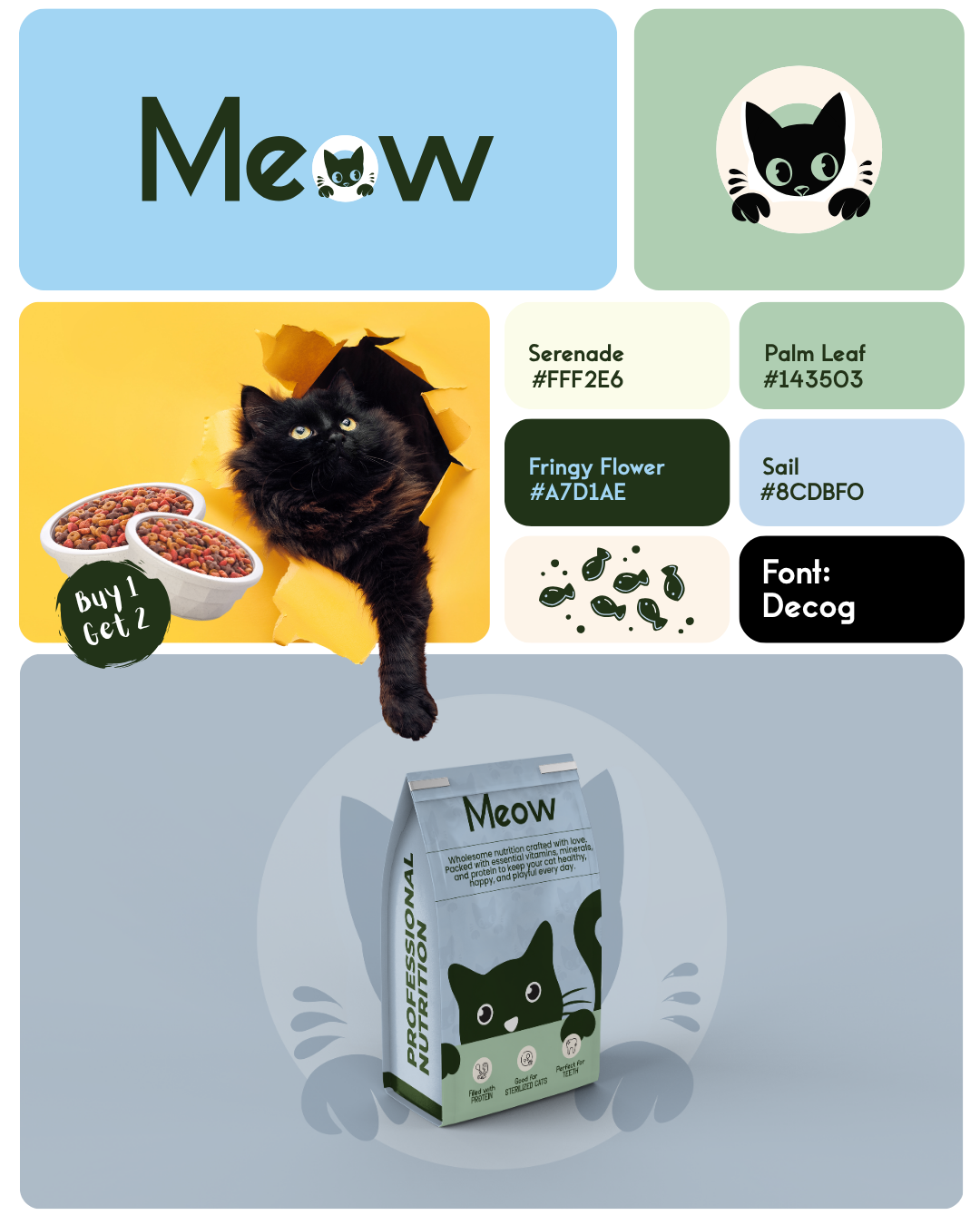
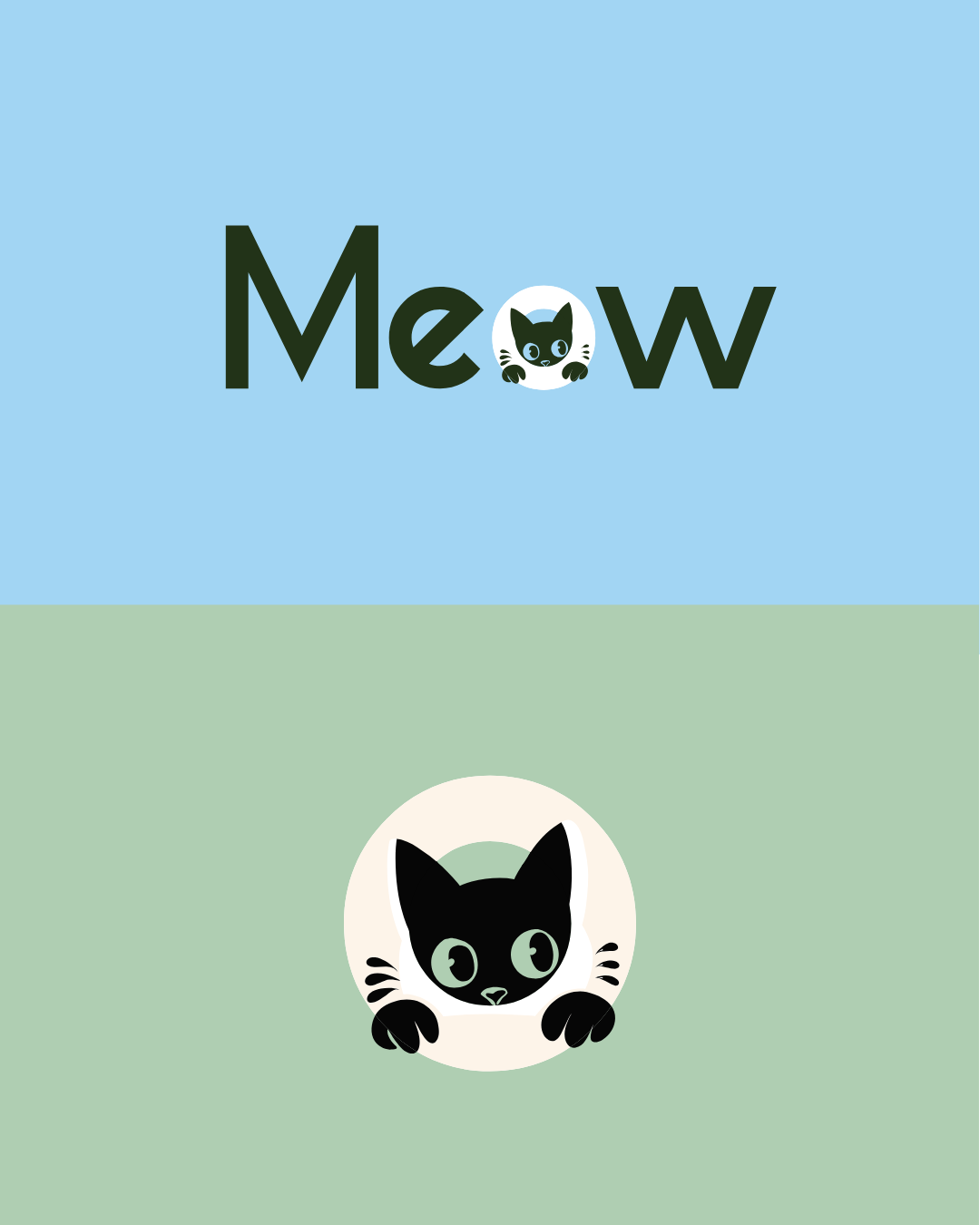
When designing the brand identity for Meow Cat Food, I started with a clear objective: to capture the charm of the feline world while projecting quality, trust, and playful sophistication. The logotype was crafted to feel approachable yet premium — clean, softly rounded letterforms reflect the friendly nature of pets and the comfort they bring to their owners. Complementing this is a mark/icon inspired by abstract cat-elements: subtle ears or whisker-cues that remain simple enough to scale gracefully across packaging, digital formats and signage.
The colour palette strikes a balance between warmth and modernity. A dominant tone evokes a comforting, trusted brand; accent colours bring personality and freshness, giving the identity flexibility across product lines while maintaining a cohesive visual language. The design system integrates typography guidelines, iconography and packaging templates so that future flavour variants, bag sizes and POS-materials can plug into the same family of design with ease.
Every application—from pouches to web banners to shelf-displays—was considered. I emphasised white space and clean layouts so that the product imagery and logo command attention, not crowded visuals. The result is a brand system that feels both premium and accessible: a cat-food brand that owners trust, cats respond to, and retailers recognise.