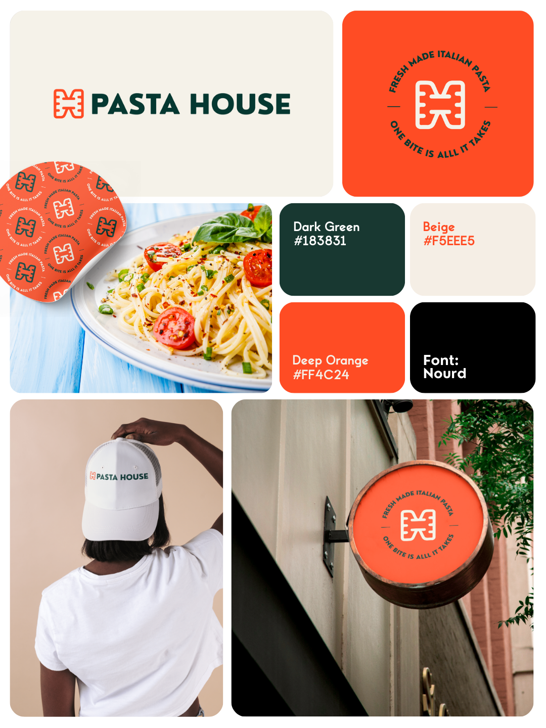
The branding for Pasta House was crafted to reflect warmth, authenticity, and modern simplicity. Built around a clean wordmark logo paired with a distinctive icon, the identity balances tradition with a fresh, contemporary aesthetic.
The typography is minimal yet expressive, designed to feel welcoming and refined at the same time. The accompanying icon subtly reinforces the brand’s culinary roots while remaining versatile enough to stand alone across packaging, signage, and digital applications.
The color palette plays a key role in shaping the brand’s personality — soft natural and beige tones create a sense of comfort and craftsmanship, while a carefully selected orange accent introduces warmth, appetite appeal, and energy. This combination results in a visual identity that feels organic, tasteful, and memorable.
Overall, the final branding system is fresh, minimal, and unique, designed to position Pasta House as both approachable and premium — a place where simplicity meets quality.