
Pasta House Brending
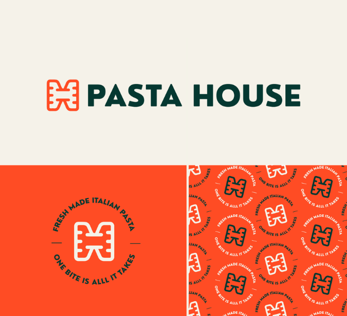
The branding for Pasta House was crafted to reflect warmth, authenticity, and modern simplicity. Built around a clean wordmark logo paired with a distinctive icon, the identity balances tradition with a fresh, contemporary aesthetic.
The typography is minimal yet expressive, designed to feel welcoming and refined at the same time. The accompanying icon subtly reinforces the brand’s culinary roots while remaining versatile enough to stand alone across packaging, signage, and digital applications.
The color palette plays a key role in shaping the brand’s personality — soft natural and beige tones create a sense of comfort and craftsmanship, while a carefully selected orange accent introduces warmth, appetite appeal, and energy. This combination results in a visual identity that feels organic, tasteful, and memorable.
Overall, the final branding system is fresh, minimal, and unique, designed to position Pasta House as both approachable and premium — a place where simplicity meets quality.
Daily Sprout Branding

The branding for Daily Sprout was designed to feel fresh, minimal, and distinctive, reflecting growth, balance, and everyday vitality. The identity is built around a custom wordmark, paired with a refined logo icon that acts as a recognizable visual symbol across digital and print applications.
The letter-based logo focuses on clarity and simplicity, using carefully crafted typography to convey approachability and modernity. Subtle details within the letterforms add uniqueness, ensuring the brand feels considered and intentional rather than generic. The accompanying icon complements the wordmark while allowing flexibility in smaller applications such as social media, packaging, and labels.
Packaging Design
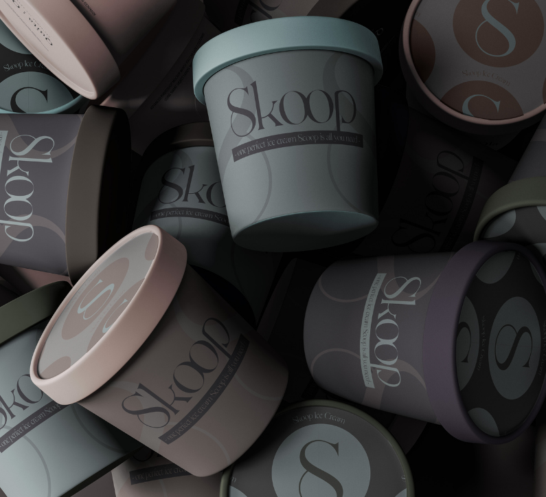
This project showcases a variety of packaging design concepts, each crafted to reflect the unique personality and positioning of the respective brand. From premium, minimalist designs to playful, colorful concepts, every package was carefully considered to stand out on the shelf while communicating the product’s story at a glance.
Key focus areas included typography, color palettes, material choice, and structural design, ensuring that each packaging solution is visually appealing, functional, and consistent with brand identity. Mockups were created to illustrate real-world applications — from retail shelves to e-commerce presentation — emphasizing versatility and scalability.
The result is a cohesive set of designs that blend creativity, strategy, and visual storytelling, demonstrating how thoughtful packaging can elevate brand perception, engage consumers, and enhance product experience.
Meow Cat Food
When designing the brand identity for Meow Cat Food, I started with a clear objective: to capture the charm of the feline world while projecting quality, trust, and playful sophistication. The logotype was crafted to feel approachable yet premium — clean, softly rounded letterforms reflect the friendly nature of pets and the comfort they bring to their owners. Complementing this is a mark/icon inspired by abstract cat-elements: subtle ears or whisker-cues that remain simple enough to scale gracefully across packaging, digital formats and signage.
The colour palette strikes a balance between warmth and modernity. A dominant tone evokes a comforting, trusted brand; accent colours bring personality and freshness, giving the identity flexibility across product lines while maintaining a cohesive visual language. The design system integrates typography guidelines, iconography and packaging templates so that future flavour variants, bag sizes and POS-materials can plug into the same family of design with ease.
Every application—from pouches to web banners to shelf-displays—was considered. I emphasised white space and clean layouts so that the product imagery and logo command attention, not crowded visuals. The result is a brand system that feels both premium and accessible: a cat-food brand that owners trust, cats respond to, and retailers recognise.
Pioner – Trading Company Branding
When building the brand for Pioner, I aimed to capture the energy of a trail-blazing company — fresh, decisive, and modern in its approach. The foundation of the identity lies in a geometric sans-serif logotype, designed to communicate precision and progress. The arrow-inspired mark symbolizes forward motion, ambition, and the brand’s continuous drive toward innovation and leadership in its field.
The color palette was intentionally kept restrained yet distinctive, allowing the logo to stand out while maintaining a clean, professional presence across various mediums. This minimalist approach ensures clarity, recognition, and adaptability, whether applied to digital interfaces, printed materials, or environmental signage.
Alongside the visual identity, I developed supporting brand elements that reinforce consistency — from typography guidelines and layout principles to mockups showcasing real-world applications. The end result is a cohesive and scalable brand system that reflects Pioner’s pioneering mindset and builds an immediate sense of trust and momentum.
Brand Design – Code
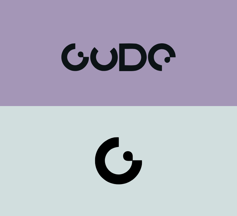
When designing the brand identity for Code, I sought to capture the essence of a forward-looking tech brand—one that is precise, dynamic and visually refined. The visual system begins with a bold word‐mark crafted in a clean, geometric sans-serif typeface, which establishes a sense of technical clarity and discipline. The accompanying mark draws inspiration from binary logic and modular systems—subtle cues that hint at code, algorithmic structure and digital architecture.
Colour and layout are treated with intentional restraint: a limited palette and ample negative space allow the core symbol to command attention while the identity remains flexible and adaptable across platforms. Modular grid constructions and subtle line‐work create a framework where each touchpoint—be it stationery, digital interface or environmental application—feels part of a unified system.
Beyond the visuals, I developed an identity toolkit including typography rules, iconography derived from structural elements, and mock-ups that show how the brand scales from business cards to web banners and signage. The resulting solution isn’t just visually consistent—it reflects Code’s ambition: to articulate complexity through clarity, to embody innovation without extravagance, and to anchor technical sophistication in a design language that feels approachable.